

Bioinformatician
Career Profile
Please introduce yourself (what is your current training/educational status and/or where do you work?) and share with us how you decided to get into scientific visualization.
Hi, I’m Bosco Ho, a bioinformatician at Monash University. I did my PhD in biophysics in Sydney and then bounced around several labs around the world. I did a stint in two theoretical biophysics labs as well as several structural biology labs. As I’ve always loved programming, I ended up choosing research topics that had tons of computation in them. This was particularly helpful in structural biology, which requires a deep appreciation of 3D geometry. I first started visualization tools to help my own research, but soon grew to enjoy doing visualization for its own sake.
What do you like the most about this field?
I love design and visuals, and scientific visualization brings that into science. Just like the clean lines of Nordic furniture, a well-designed visual is tasteful, gorgeous and practical in equal amounts. As well, a clever visualization can bring insight to a hard problem. More specifically, 3D visualizations taps into algorithms used in physics and computer games, and I love physics and computer games.
How and where did you acquire your current skillset in scientific visualization? Was it all via a graduate or other program or are you self taught? If so, did you use any particular online resources to help with your training?
I am a self-taught programmer, and I’ve learnt many different languages over the years. I started with Basic, used a lot of Pascal and C/C++, dabbled in some Matlab and Fortran, and now I mostly use Python. However for visualization, I do most of my programming in Javascript.
For 3D computer graphics, all the math I learnt in my physics degree came in very handy, especially projective geometry and linear algebra. To understand the math takes a lot of work, and there’s really no easy way to do this.
Learning languages means going through lots of tutorials and examples. Finding a good set of working examples is gold. After getting familiar with the basics, I’d look for a good textbook pitched at the right level – not too simple and not too hard. I learnt a lot of stuff before the internet was around, so getting my hands on good textbooks was the real bottleneck, requiring some smooth talking and lots of photocopying. Now, so much good stuff is on the internet and the hard part is sorting out the good stuff from the bad. Once you get beyond a textbook, you need to get to grips with online documentation. This is a useful skill to have, which sometimes requires you to slog through the source code.
What do you consider some of the biggest barriers to entering the field? Are they technical, training, scientific, professional (availability of jobs or projects)?
The main barrier is that there is no obvious training to do scientific visualization. This is both a good and bad thing. It’s bad because you basically have to teach yourself, but that means it’s good because there are not many people who can do it. In my experience, if you build a good tool, people will just use it. Building a good visualization tool means marrying your self-taught skills with an actual problem. But finding a good problem is really hard! With visualization, you are fortunate in that it doesn’t require a lot of computation, so it’s ideas and elegant user-interface design more than anything else.
How do you feel your PhD training has had an impact on your scientific visualization work? What specific skills from your training have empowered you in your scientific visualization work? Do you think your PhD has given you a unique perspective on viewing, interpreting, and creating scientific visualizations?
Doing a PhD meant that I had to learn how to teach myself about new fields and to dig into the scientific literature – it’s vast. I once had the pleasure to use a geometric equation from an 1898 paper to solve a 3D structural geometry problem for proline rings. Indeed, working in computational structural biology, I was exposed to many rich visual tools, many with complicated interaction models and user interfaces. There is a huge variety of ways to build something as standard as a protein viewer. And many of these tools are open-source, so you could go and figure out how they did a lot of things.
I also like maths and quantitative analysis, and I found that my physics degree led naturally to computer science – there is a rich fertilization between statistical mechanics, information theory, and machine learning. I’ve found that there is a striking difference in how statistical analysis is practiced between physics and biology. Biologists tend to use sophisticated statistical analyses on sketchy data, whilst physicists use simple statistical analysis on exhaustive well-controlled data. Both approaches are legitimate and my PhD work sat in between these regimes. Designing meaningful visual metrics for a piece of measurement requires careful consideration of such issues.
Which practitioners (or what visualizations) have been most inspirational to you?
Jane Richardson. I met Jane years ago when I was a grad student after my supervisor had raved about her. Not only is she one of the sharpest crystallographers around, but she has spent her career building incredible visual and analytical tools for crystallographers (such as Kinemage, a visual scene builder for protein structures). She has written one of the best introduction to structural biology “Anatomy and Taxonomy of Protein Structures”, which contains 77 beautiful hand-drawn figures of proteins using the now-standard ribbon representation of protein structures, which Jane invented.
David Goodsell. David is the world’s greatest scientific illustrator. I remember the first time I laid eyes on David Goodsell’s water-color illustrations, they were revolutionary. Although I’d been studying proteins for several years, this was the first time I could concretely picture what the inside of a cell might look like, in a way that did not offend my understanding of protein chemistry. There is real art and technique in how David both simplifies and amplifies the molecules in his illustrations. His visual style is understated and organic, and tastefully avoids flashy irrelevant glosses used elsewhere. Sorry, I am waxing lyrical and suggest you just read his book “The Machinery of Life”, to appreciate his prose as much as his illustrations.
Which conferences would you recommend to those interested in this field and why? What particular insights or benefits did you get out of attending this (these) conferences?
I haven’t been to many conferences but I did recently go to the International Conference on Systems Biology, which gave a panoramic view of where biology is heading, and didn’t get too lost in niche topics. Perhaps SIGGRAPH to see where computer graphics is heading, and I’ve heard good things about 3DSig, the structural-bioinformatic satellite meeting of the main conference for Intelligent Systems for Molecular Biology (ISMB).
If there was one resource, tool or conference that you could wish for to facilitate your work, what would it be?
Make no bones about it, but Javascript is now the most important language in the world. It has a central place in computation and will never be replaced. Yes there are many awful corners in Javascript but with sufficient discipline, you can avoid them. Fortunately, the proposals for Javascript 6 and 7 fixes most of these problems, and these future releases will vastly improve Javascript programming, making web-programming safer and more expressive. They can’t come fast enough.
What other advice would you offer those interested in either a professional or full-time academic career in scientific visualization?
make web-sites – website programming is visualization; and there is a vast of amount of material out there to learn and steal from. Also I believe that scientific visualization is going to happen mostly on the web, and making websites will improve both your design and programming skills
learn graphic design – in the end you realise that good scientific visualizations is just good visualization, which is graphic design. Learn the proper theory and you will have a clearer idea of what you are trying to achieve. Be warned: you may start to obsess too much about fonts.
go to art museums – see how other people have visualized things in the past. Learn how they transformed brute materials into images that delight the eye.
Please comment briefly on the samples/links that you have submitted for this profile… why in particular are you proud of these and what do you hope viewers will notice and get from seeing them?
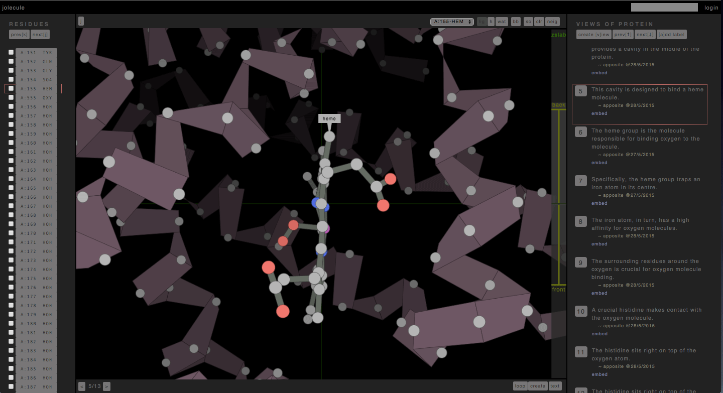
http://jolecule.com – has been an evolving project of mine over the last 10 years. I first wrote a protein viewer (the Ramachandran Plot Explorer) during my PhD with a pseudo 3d graphics engine I designed myself. Later, when I HTML5 came along, and I rewrote it as a web-app hosted on Google App Engine. And now that proper OpenGL has arrived in the form of WebGL, I am rewriting it with real honest-to-god 3d graphics.
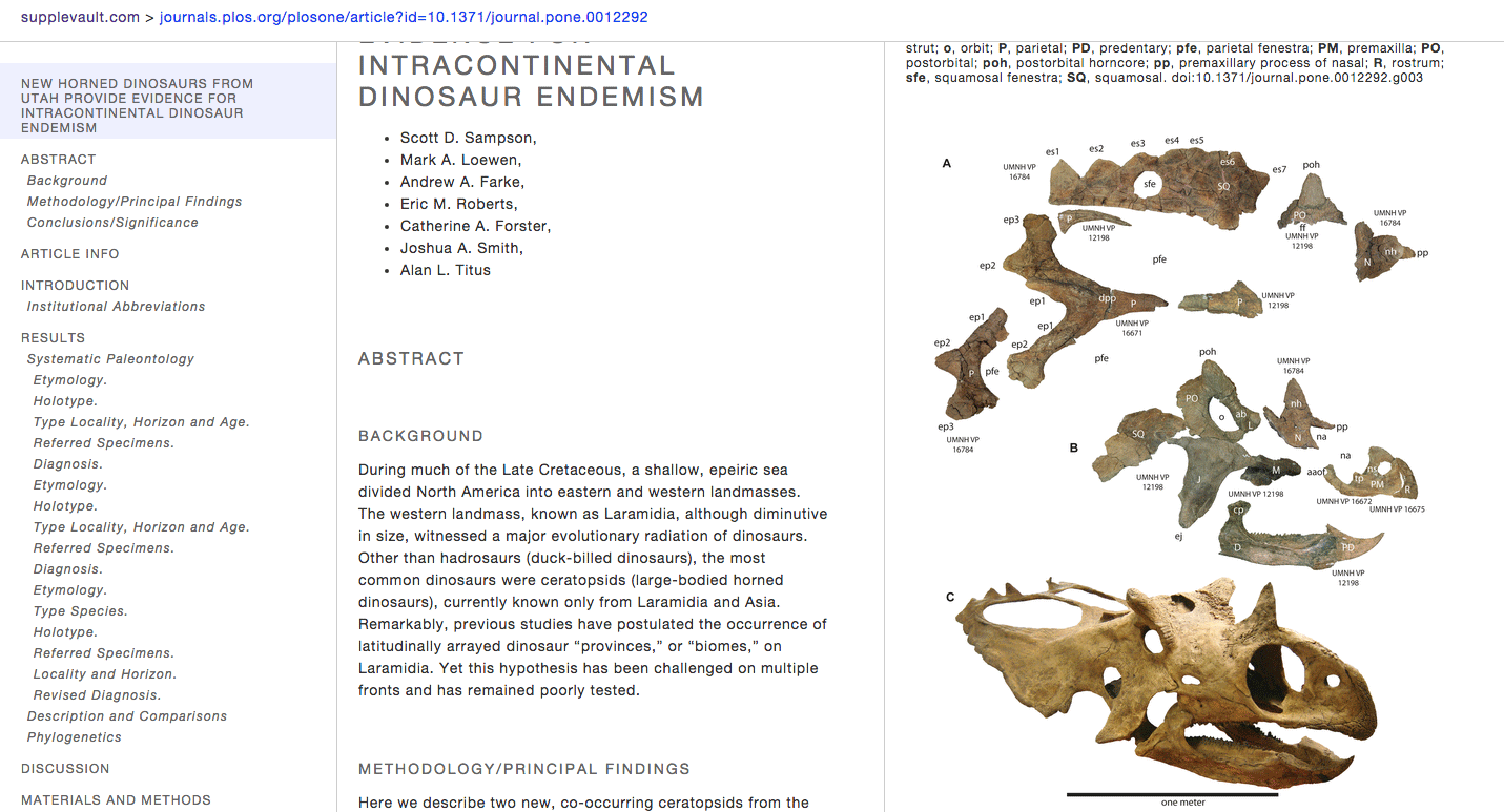
http://boscoh.github.io/supplevault – I’ve always been unhappy with the online scientific article reading experience. Scientific journals are such a conservative bunch. It’s 2015 and still some journals don’t understand simple print design things like legible fonts and whitespace, let alone bleeding-edge stuff such as javascript-based interactivity. Anyway, in a pique of frustration, I finally sat down and designed my own interactive scientific article UI format and cobbled together an article reformatter for PLoS articles (http://supplevault.com). I believe this is the easiest way to read scientific articles online.
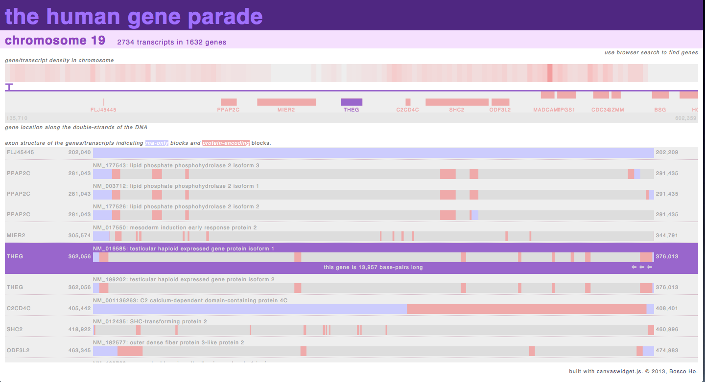
http://boscoh.com/geneparade/human/ – when I started working on genomic analysis, I got slightly obsessed with non-coding RNA sequences and wanted to see the distribution of exons and introns across an entire genome. After failing to find anything like that online, I wrote this visualization to provide an overview of the exon/intron structure of the genome, which allowed me to try out techniques such as asynchronous loading of data and dynamic building of DOM elements.
Where do you think the field scientific visualization is ‘going’? Do you perceive any trends in its evolution or are there certain directions that you would like to see implemented?
Two obvious trends are: graphics cards in web-browsers, and virtual-reality head-sets. With the maturing WebGL specification in web-browsers, proper 3D graphics is now available in a web-page, as WebGL builds a direct tunnel to the graphics card on your machine. Moreover, the WebGL is radically simpler to program than using more traditional methods of OpenGL programming. I think this will lead to a wave of innovation in graphical web-apps. As for affordable virtual reality head-sets (e.g. Occulus Rift), I am sure this will allow a whole new level of interaction that I can’t possibly visualize. I’ll let enthusiastic futurists tell that you all about it.
One not-so-obvious trend is the need for clever computing in mobile. In the days of computing, say the Commodore 64, programmers had to do a lot of tricky things to make games run fast enough: procedural programming, hand-coded algorithms, and convoluted packing of data. In the intervening decades, desktop computers became powerful, and we were told to avoid such tricks and write obvious code, letting the compilers figure out the complexity of our programs. But in the world of constantly connected mobile smartphones (computers), we have to write for computers that are slow, that need to conserve battery, and that are poorly connected to the internet. This is unlikely to change. As a result, mobile programmers are reviving many tricks from the old days of programming. Being a middle-of-the-road Java programmer will not be good enough. To make compelling mobile programs, you will need to be clever like the Commodore 64 game programmers of old.
And then lets end with a simple question… What is your ‘10 year plan’ in terms of what you hope to accomplish in scientific visualization?
We are now awash in tools, many of them free and open-source. I’ve had to learn 5 different protein viewers over my career, and I switch between them constantly. It’s painful. The future is to connect these scientific tools up via the web. I can think of two examples to illustrate what this might entail: Wikipedia and Github. Many people have tried to build alternative scientific ‘Wikipedia of Blah’. But if it’s just information, nothing beats just using Wikipedia. Nowadays I look up standard scientific values – say atom radii – on Wikipedia. Github, on the other hand, provides a great example of connecting something much more complicated than brute information. Github networks computer source-code via a great source-control program (git), a beautiful central hub on the web (http://github.com) and the careful cultivation of a community (open-source programmers). If science ever breaks out of the silo of flakey lab-based software, I’d wager it will look something like Github. I’d like to build something like that for structural biology visualization.
Portfolio Link: http://boscoh.com